soundStrider v0.2.0
Since announcing soundStrider I have dedicated over thirty hours to its development and received an outpouring of support from empathetic friends and piqued ears. Its first minor version increase represents a major milestone for the project as it receives a graphical user interface and tooling to facilitate its eventual distribution.
Continue reading for fresh screenshots and a tentative roadmap.
Crafting a visual identity
When I began developing soundStrider I was focused primarily on proving its technical feasibility. Now with a game engine capable of generating and rendering complex scenes of synthesized sounds, there were many possible paths forward.
My first instinct was to spend time filling it with content at my own pace; however, losing my day job changed its trajectory by convincing me that my first week back from the holiday should be spent giving it a face so it could be more easily shared and enjoyed.
The result is a minimalist aesthetic with high contrast and bold colors.
Application icon
While it’s easy to discount it as a mere triviality, the most frequent visual device a user will encounter for any piece of software is its icon. With every passing glance, users form an emotional bond with the icons on their desktop or home screen. So it seemed like a logical place to start when formulating soundStrider’s visual identity:

When designing the soundStrider icon, I began with a simple sketch in black ink. My objective was to emphasize the shape of sinusoids and the camelCase stylization of its title. Within Adobe Illustrator I then introduced a warm palette consisting of my favorite colors; these would later become the colors used throughout its user interface.
Eventually I would like to refine its appearance for smaller resolutions, but for now it’s an acceptable first draft.
Splash screen
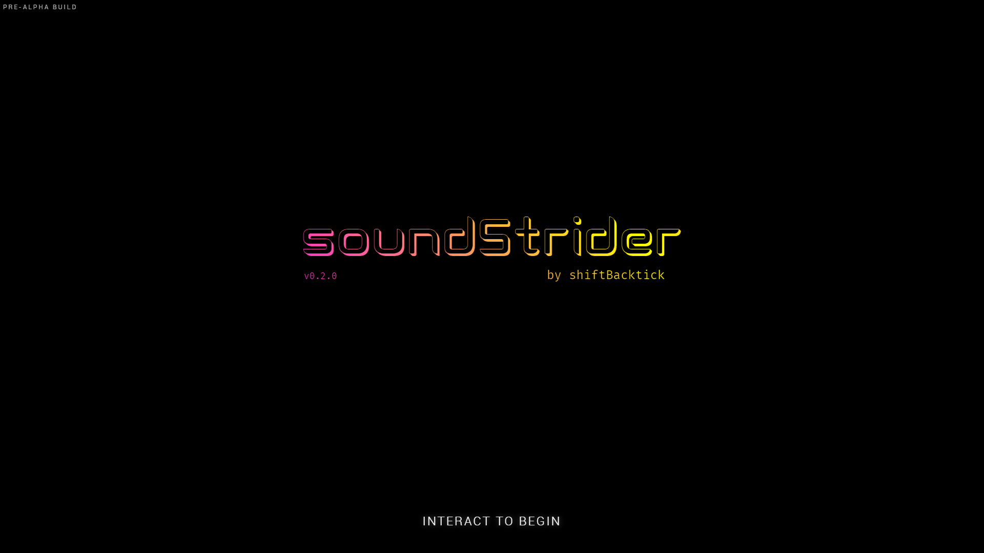
A splash screen was created to introduce users to soundStrider and solve a technical limitation for web clients. While this is unneeded for its desktop builds, Chrome’s autoplay policy creates many problems for games on the web. So this screen requires an interaction before starting the main audio context. And it looks cool too:

For soundStrider’s logotype I selected the Cogtan Shadow typeface by designer Leandro Ribeiro Machado. It’s contemporary, geometric, and—specific to the theme of soundStrider—implies the presence of something through its visual absence. I look forward to crediting him in-game and sending a free download for his lovely contribution.
Not pictured are its subtle animations, which give the screen a regular pulse as its colors cycle and its prompt fades in and out. Consider it a preview of the psychedelic and meditative experience to follow.
Menu interface
Unlike Soundsearcher, where players are simply dumped into the experience, soundStrider has multiple modes of play which need accessed through a simple yet robust menu system. It continues the theme from the previous screen and leverages clear focus styles for the selected item:

Implementing this screen took the most time because it revealed many of the challenges ahead, including: controller support, focus management, keyboard and screen reader accessibility, and state management. The user interface was beginning to need an engine of its own.
Solving new challenges
Preparing soundStrider for distribution raised many questions that the engine wasn’t prepared to answer.
To separate the concerns of the user interface from the game engine, it was created as a distinct layer which acts as a wrapper around the engine. This design decision allows the interface to dictate how the engine should behave, much like how a web application might leverage a third-party library. It also makes the engine more reusable for other spatial audio applications beyond soundStrider—believe me, I have ideas!
Handling application state
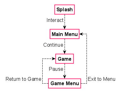
Understanding that soundStrider would have quite a few menus and game modes, I began by drawing a storyboard of each of its screens and their transitions. After a few frames the model began to resemble a finite-state machine—something which I’ve researched deeply in the past but never had an appropriate opportunity to implement until now.
Here is a simplified version of the model which illustrates how players would start, pause, resume, and exit the game:

State machines were implemented as a reusable utility that could be instantiated with the desired states and transitions.
This allowed me to create one to handle overall application state and leverage others internally within individual screens.
For example, when starting a new game the screen is in an invalid state until a seed is specified, after which it will enter a valid state and enable a submit button; clicking submit dispatches an event to the main state machine, which then transitions to the game screen.
Leveraging finite-state machines is revelatory for code clarity because they separate business logic from intent, allowing us to reason with state rather than assume it when reading or debugging our code. I don’t want to imagine how the codebase would read without them.
Prioritizing accessibility
Creating perceivable, operable, understandable, and robust user experiences has long been a top priority of mine. For soundStrider—a game designed for playing closed-eyed—my commitment to accessibility and inclusivity could not be stronger.
By developing with open web technologies there are many accessibility features that we get for free as long as we follow their specifications and approach implementation from an accessibility-first mindset.
For example, leveraging a <button> for a clickable interface component inserts it into the tab order and maps Enter and Space keypresses to click events when focused.
Attempting that with a <div> requires many times more code and testing to be successful, especially for users of assistive technologies.
Applying this paradigm to soundStrider seemed simple in principle, but what about navigating with the arrow keys or a gamepad?
eachFrame(() => {
  const controls = getControls()

  if (controls.confirm) {
    clickFocusedElement()
  } else if (controls.down) {
    focusNextElement()
  } else if (controls.up) {
    focusPreviousElement()
  }
})
The answer was to keep it simple and cheap by listening for click events on each button so standard keyboard navigation remains unaffected. A controls module maps other keypresses and gamepad events to a unified interface which is queried on each frame. Elements are then clicked or focused based on its current state, resulting in a user interface that is accessible across multiple input devices.
Tooling and task automation
What started as a simple index file soon balooned into dozens of JavaScript files. It became apparent that I needed a more long-term strategy for building and distributing soundStrider as a standalone product.
Although I’m a huge advocate of learning by doing—including reinventing the wheel for educational purposes—Node.js was ultimately integrated into the codebase to expedite and assist with the more mundane tasks. Otherwise I typically shy away from third-party libraries because they’re essentially black boxes that cause more problems than they solve.
At my previous job as a full-stack developer I had cautiously worked to improve inadequate development practices, in part, through automation without introducing too much complexity for the team. There I leveraged Grunt to automate tasks like unit testing, concatenating source files, and generating documentation from JSDoc comment blocks.
For soundStrider I wanted to expand my knowledge of tooling. After some research, I concluded that gulp was a robust alternative that would allow me to remain in the JavaScript ecosystem. Configuring it to minify soundStrider’s source files and package it as an Electron application for desktop users was straightforward. I would certainly recommend it for future projects.
Upcoming milestones
With soundStrider beginning to resemble more of a real product, its general roadmap has become clearer:
- Early access release. By the end of March I intend to distribute the first playable version of soundStrider on itch.io for a reduced price. A Steam release may shortly follow once I understand the platform better. This version will contain working implementations of game systems and features; however, it will lack polish and some content.
- Alpha point releases. Throughout April there will be a series of weekly releases across distribution channels. Development blogs will begin incorporating patch notes for those following along. During this period, saved games and bookmarks will break as content and features are refined, affecting progress and its procedural systems.
- Beta point releases. Beginning in May the game will enter a beta period and feature freeze at its intended launch price. Weekly point releases will polish existing features, fix outstanding bugs, and address any issues with accessibility and system compatibility. It’s unlikely, yet entirely plausible, that saves could still be affected.
- Stable gold release. In June the game will be stable enough for its full 1.0 release at a temporary sale price. By then I’ll have a better understanding of my long-term prospects and reveal how I intend to support the game with future patch releases.
In the meantime, there are plenty of updates forthcoming. I’m excited to share more about implementing dynamic footsteps, seeding a procedural quest system, and creating a variety of naturalistic and abstract soundscapes.